本篇为《Python数据可视化实战》第十篇文章,我们一起学习一个交互式可视化Python库——Bokeh。
Bokeh基础Bokeh是一个专门针对Web浏览器的呈现功能的交互式可视化Python库。这是Bokeh与其它可视化库最核心的区别。
①获取数据
②构建画布figure()
③添加图层,绘图line,circle,square,scatter,multi_line等;参数co
lor,legend
④自定义视觉属性
⑤选择性展示折线数据,建立复选框激活显示,复选框(checkbox)
导入库和数据 import numpy as np import bokeh from bokeh.layouts import gridplot from bokeh.plotting import figure, output_file, show 图表实例1.散点图
import numpy as np import bokeh from bokeh.layouts import gridplot from bokeh.plotting import figure, output_file, show # output_file("patch.html") #输出网页形式 p = figure(plot_width=100, plot_height=100) #数据 N=9 x=np.linspace(-2,2,N) y=x**2 sizes=np.linspace(10,20,N) xpts=np.array([-0.09,-0.12,0.0,0.12,0.09]) ypts=np.array([-0.1,0.02,0.1,0.02,-0.1]) p=figure(title="annular_wedge") p.annular_wedge(x,y,10,20,0.3,4.1,color="#8888ee",inner_radius_units="screen",outer_radius_units="screen") # Set to output the plot in the notebook output_notebook() show(p)
2.多分类的散点图
from bokeh.sampledata.iris import flowers from bokeh.plotting import figure from bokeh.io import show, output_notebook #配色 colormap={'setosa':'red','versicolor':'green','virginica':'blue'} colors=[colormap[x] for x in flowers['species']] #画布 p=figure(title='Tris Morphology') #绘图 #flowers['petal_length']为x,flowers['petal_width']为y,fill_alpha=0.3为填充透明度 p.circle(flowers['petal_length'],flowers['petal_width'],color=colors,fill_alpha=0.3,size=10) #显示 output_notebook() show(p)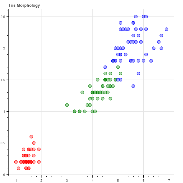
3.数值大小以散点图大小来表示
import numpy as np from bokeh.sampledata.iris import flowers from bokeh.plotting import figure from bokeh.io import show, output_notebook x=[1,2,3,4] y=[5,7,9,12] sizes=np.array(y)+10 #气泡大小 p=figure(title='bubble chart') p=figure(plot_width=300,plot_height=300) p.scatter(x,y,marker="circle",size=sizes,color="navy") output_notebook() show(p)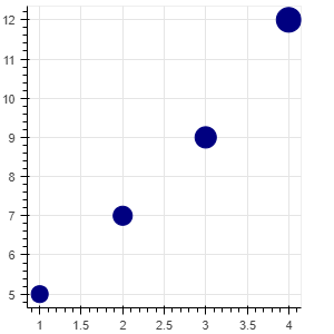
4.折线图line
from bokeh.layouts import column, gridplot from bokeh.models import BoxSelectTool, Div from bokeh.plotting import figure from bokeh.io import show, output_notebook # 数据 x = [1, 2, 3, 4, 5, 6, 7] y = [6, 7, 2, 4, 5, 10, 4] # 画布:坐标轴标签,画布大小 p = figure(title="line example", x_axis_label='x', y_axis_label='y', width=400, height=400) # 画图:数据、图例、线宽 p.line(x, y, legend="Temp.", line_width=2) # 折线图 # 显示 output_notebook() show(p)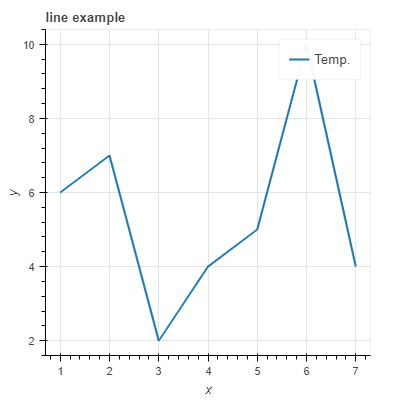
5.同时展示不同函数,以散点和折线方式
# 数据,同时展示不同函数,以散点和折线方式 x = [0.1, 0.5, 1.0, 1.5, 2.0, 2.5, 3.0] y0 = [i**2 for i in x] y1 = [10**i for i in x] y2 = [10**(i**2) for i in x] # 创建画布 p = figure( tools="pan,box_zoom,reset,save", y_axis_type="log", title="log axis example", x_axis_label='sections', y_axis_label='particles', width=700, height=350) # y轴类型:log指数或linear线性 # 增加图层,绘图 p.line(x, x, legend="y=x") p.circle(x, x, legend="y=x", fill_color="white", size=8) p.line(x, y0, legend="y=x^2", line_width=3) p.line(x, y1, legend="y=10^x", line_color="red") p.circle(x, y1, legend="y=10^x", fill_color="red", line_color="red", size=6) p.line(x, y2, legend="y=10^x^2", line_color="orange", line_dash="4 4") # 显示 output_notebook() show(p)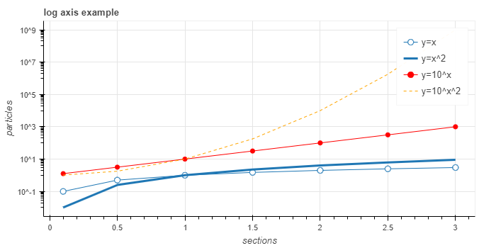
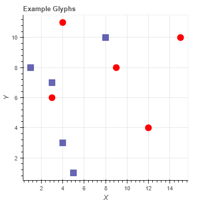
6.不同颜色不同形状表示不同类别的事物
# 数据,同时展示不同函数,以散点和折线方式 x = [0.1, 0.5, 1.0, 1.5, 2.0, 2.5, 3.0] y0 = [i**2 for i in x] y1 = [10**i for i in x] y2 = [10**(i**2) for i in x] # 创建画布 p = figure( tools="pan,box_zoom,reset,save", y_axis_type="log", title="log axis example", x_axis_label='sections', y_axis_label='particles', width=700, height=350) # y轴类型:log指数或linear线性 # 增加图层,绘图 p.line(x, x, legend="y=x") p.circle(x, x, legend="y=x", fill_color="white", size=8) p.line(x, y0, legend="y=x^2", line_width=3) p.line(x, y1, legend="y=10^x", line_color="red") p.circle(x, y1, legend="y=10^x", fill_color="red", line_color="red", size=6) p.line(x, y2, legend="y=10^x^2", line_color="orange", line_dash="4 4") # 显示 output_notebook() show(p)