这篇文章主要为大家详细介绍了Jquery组件easyUi实现手风琴示例,文中示例代码介绍的非常详细,具有一定的参考价值,感兴趣的小伙伴们可以参考一下
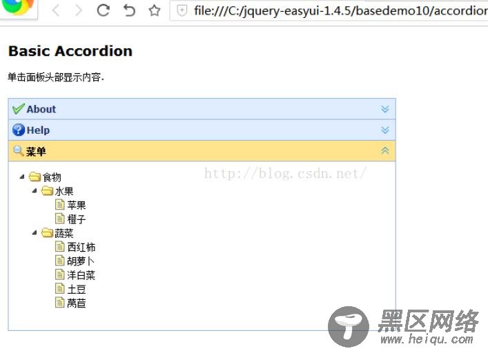
本文是为大家分享了Jquery easyUi手风琴效果,供大家参考,具体内容如下
效果图:
<!DOCTYPE html> <html> <head> <meta charset="UTF-8"> <title>Basic Accordion - jQuery EasyUI Demo</title> <link type="text/css" href="https://www.jb51.net/themes/default/easyui.css"> <link type="text/css" href="https://www.jb51.net/themes/icon.css"> <link type="text/css" href="https://www.jb51.net/demo.css"> <script type="text/javascript" src="https://www.jb51.net/jquery.min.js"></script> <script type="text/javascript" src="https://www.jb51.net/jquery.easyui.min.js"></script> </head> <body> <h2>Basic Accordion</h2> <p>单击面板头部显示内容.</p> <div></div> <div> <div title="About" data-options="iconCls:'icon-ok'"> <h3>手风琴</h3> <p>手风琴组件.</p> </div> <div title="Help" data-options="iconCls:'icon-help'"> <p>The accordion allows you to provide multiple panels and display one or more at a time. Each panel has built-in support for expanding and collapsing. Clicking on a panel header to expand or collapse that panel body. The panel content can be loaded via ajax by specifying a 'href' property. Users can define a panel to be selected. If it is not specified, then the first panel is taken by default.</p> </div> <div title="菜单" data-options="iconCls:'icon-search'"> <ul> <li> <span>食物</span> <ul> <li> <span>水果</span> <ul> <li>苹果</li> <li>橙子</li> </ul> </li> <li> <span>蔬菜</span> <ul> <li>西红柿</li> <li>胡萝卜</li> <li>洋白菜</li> <li>土豆</li> <li>莴苣</li> </ul> </li> </ul> </li> </ul> </div> </div> </body> </html>
以上就是本文的全部内容,希望对大家的学习有所帮助,也希望大家多多支持脚本之家。
您可能感兴趣的文章: