<img src="https://www.jb51.net/images/8.jpg" alt=""> <button>显示大图</button> <div> <div> <header> <span>×</span> </header> <div> <img src="https://www.jb51.net/images/8-1.jpg"> </div> </div> </div>
js部分:
var btn = document.getElementById('showMax'); var mtclose = document.getElementsByClassName('mtclose')[0]; var modalBox = document.getElementById('modalBox'); btn.addEventListener('click', function(){ modalBox.style.display = "block"; }); mtclose.addEventListener('click', function(){ modalBox.style.display = "none"; });
css部分:
.btn{ width: 100px; height: 35px; border-radius: 5px; font-size: 16px; color: #F97B39; position: absolute; top: 130px; left: 160px; opacity: 0.2; cursor: pointer; /*鼠标小手*/ } .btn:hover, .btn:focus{ /*focus 取得焦点状态*/ background-color: #8AA7F9; opacity: 0.5; color: #FFFFFF; } .modalBox{ display: none; width: 100%; height: 100%; position: fixed; left: 0; top: 0; z-index: 1000; background-color: rgba(0,0,0,0.5); } .modalBox-matter{ display: flex; /*/*弹性布局*/ flex-flow: column nowrap; justify-content: space-between; /*两端对齐*/ width: 50%; height: 80%; margin: 30px auto 100px; border-radius:10px; -webkit-animation: zoom 0.6s; animation: zoom 0.6s; resize: both; overflow: auto; } @keyframes zoom{ from {transform: scale(0)} to {transform: scale(1)} } .modalBox-header{ margin-left: 617px; } .mtclose{ color: #602E2A; font-size: 3em; font-weight: bold; transition: all 0.3s; /*z-index: 1010; */ } .mtclose:hover, .mtclose:focus{ color: #602E2A; cursor: pointer; } .modalBox-body{ padding: 10px; font-size: 16px; }
效果

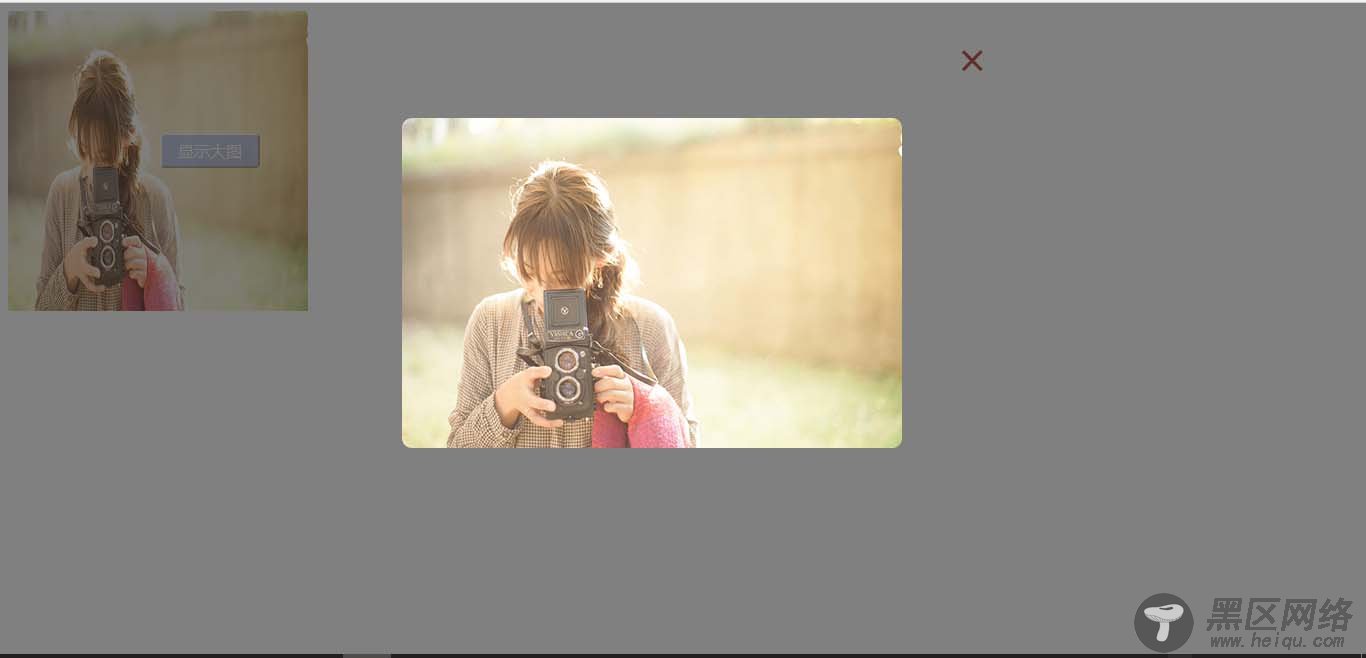
因为正在进行的一个项目中,需要一个模态框,所以花时间在网上自学的,相对来说比较简单,可以自行修改内容。。。
以上这篇原生js实现简单的模态框示例就是小编分享给大家的全部内容了,希望能给大家一个参考,也希望大家多多支持脚本之家。
您可能感兴趣的文章: